Romans · Week 3
No condemnation
Started in Romans 8:1 KJV and kept going to Romans 8:28 KJV. Now is the word I missed the first time.
 HarvousDesign, product and build · 2024 – 2026
Classic made organization the point, with folders, threads and a sidebar to file every note. Each rebuild taught the same thing: see one surface at a time, as simple as a Google Doc.
Home: the day as a sheet, with yesterday and the day before stacked behind it.Reader: the chapter is a sheet of paper, the one before it peeking above.
Classic looked like a website. 2.0 made it feel native, and 3.0 retired the sidebar for sheets of paper. These are the real screens from each.
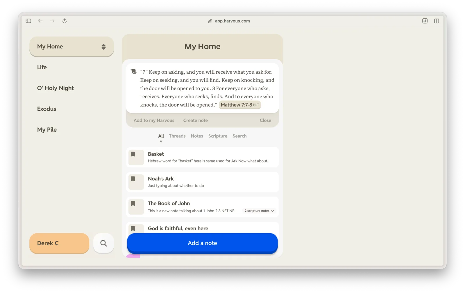
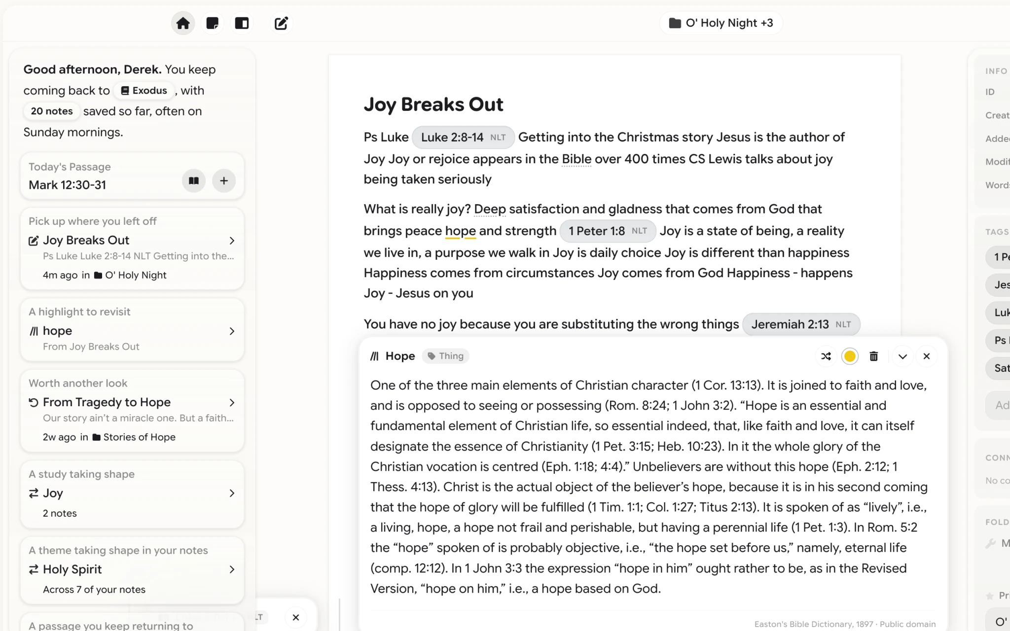
Classic, 2025: threads as colored piles down the side, one column of cards, and a big blue button to add a note.2.0, Jul 2026: sketched as a Mac app first. A glass sidebar, the note as paper in the middle, and an inspector.3.0, Sep 2026: no sidebar. The chapter is a sheet of paper with the last one peeking above it, and Search is one chip in the middle.
Making Harvous 1.0, in Figma Two years in one messy Figma file, from first sketches to the first ship. Pan and zoom around it.
Four layouts in a day On April 25 I built a Mac prototype and tried four layouts before dinner, from a split view to three columns like Notes. From then on, the native look was the one the web had to match.
A study desk, not a dashboard The rule I wrote for 2.0. Warm paper, one thing in the middle, and nothing that counts at you.
The sidebar did too much Recent study, things to revisit, your lists and search, all in one column. In 3.0 the day became Activity, and search moved to the chip in the middle.
Kids under 13 get a private place of their own. It keeps the adult app's paper and its day sheets, with fewer choices and bigger targets. This is the real notebook, live.
Home asks one question, where would you like to start, and offers two answers: read together, or keep writing.Four tabs instead of a feed: all, keep going, look back, and ideas for what to write.The same reader as the adult app, with a family Bible beside their own.A note is a sheet of paper with a title, a way to add scripture, and nothing else.The menu has three things, and the last is I'm all done, so leaving is as clear as arriving.
A list of settings asks a child to read. So the notebook's cover is built one picture at a time, color, pattern, sticker, style and pages, and the backgrounds are swatches.
Step one: what color should it be? Six named colors, and the notebook above changes as you pick.Plain or patterned, shown as four covers, not four words.A sticker for the front, from a row you can see all at once.What kind of notebook is it: classic, spiral or stitched.And what the pages are like inside. Five small choices, each one visible.The same idea for the app's look: backgrounds as painted swatches, and text size as two sizes of Aa.
Harvous has one icon and no logo to redraw. These are its guidelines as a client gets them, a section to a slide, drawn from the tokens the app and the site share.
01
The app icon is the logo. Keep its corners and its colors, and give it room. Never put it in a container.

02
One icon at every size, from the home screen to a browser tab. It changed twice, and the third stuck.

 2025The first, on flat blue
 Harvous 1Softer, with lightHarvous 2The icon now
03
The name sits beside the icon in Google Sans Flex 600. Its cap height is 0.8 of the icon, with a gap of a third.
Harvous⅓0.8  HarvousHarvous
08
Painted skies are for a hero, a quote, a lock screen. Never behind something that has to be read.

ai_bg_077
ai_bg_050
ai_bg_058
ai_bg_076
ai_bg_045
ai_bg_075
Remember what you studied. Try Harvous
Remember what you studied. Try Harvous
Every picture of Harvous on its site is the app's own components, not a drawing, on the same painted backgrounds. These are the sections under the hero.
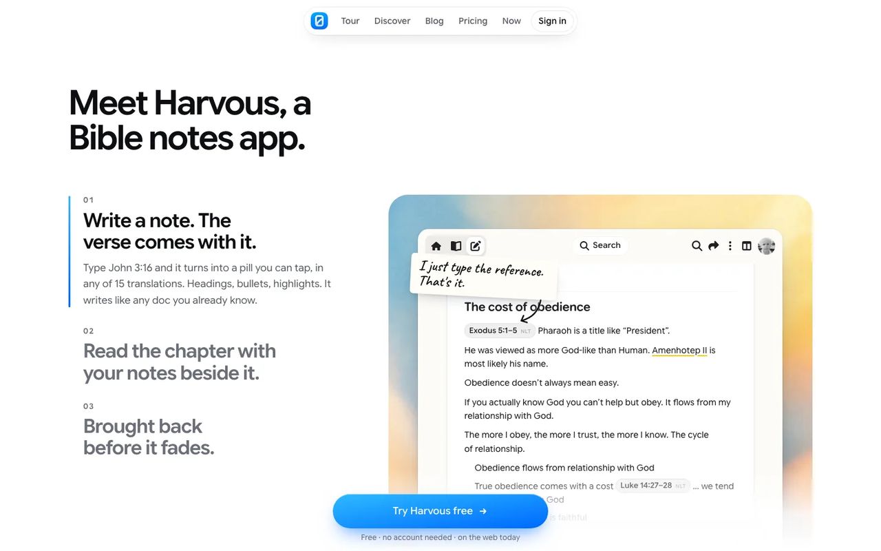
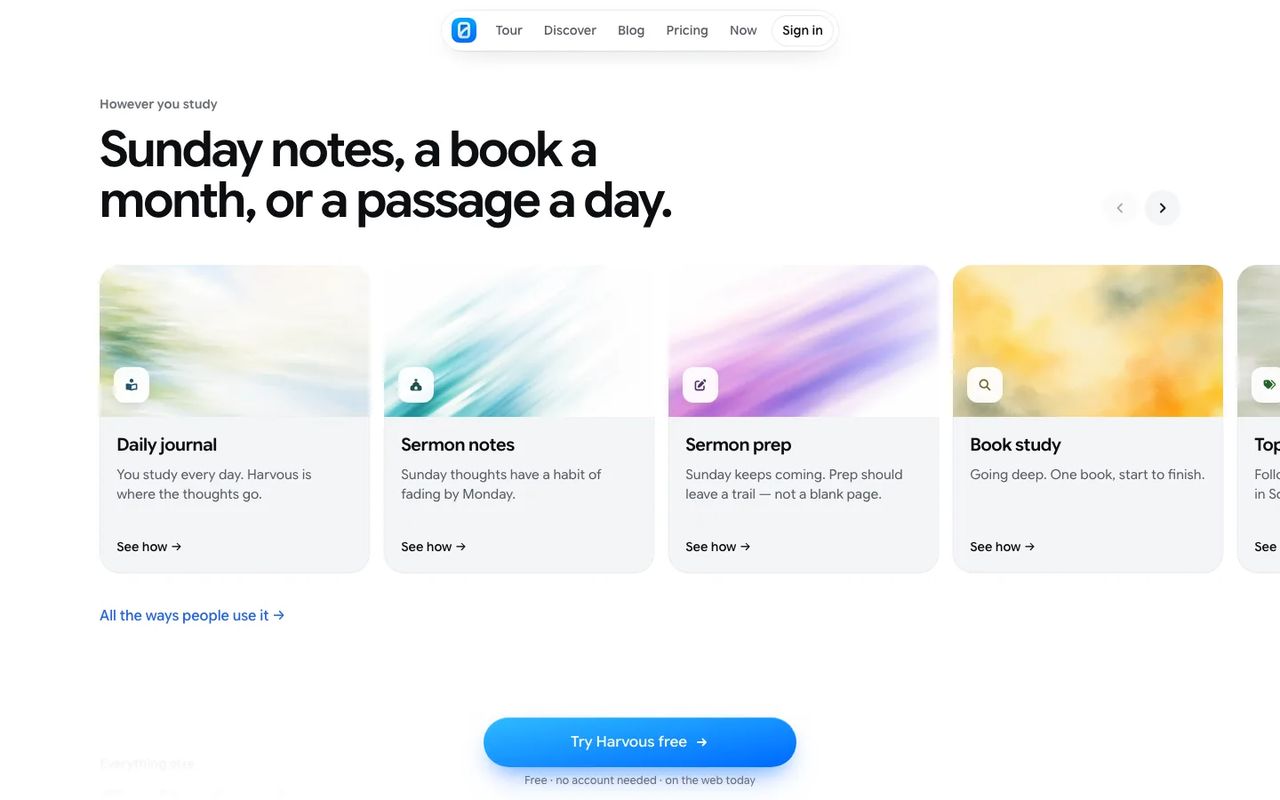
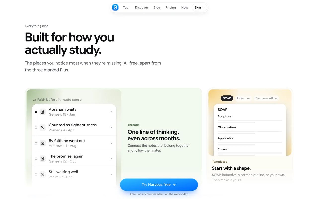
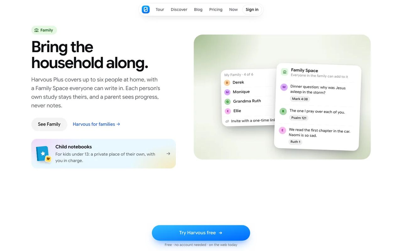
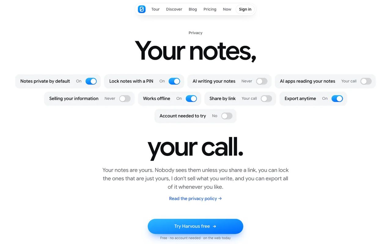
Under the hero: three steps on the left, and the app showing each one on a painted background.Ways people use it, each on its own painted card: a daily journal, sermon notes, a book study.A bento of the pieces you notice most when they’re missing, drawn from the app’s real parts.Family Space and child notebooks, with the real family list and a shared note.Privacy as switches you can read at a glance, set the way the app sets them.
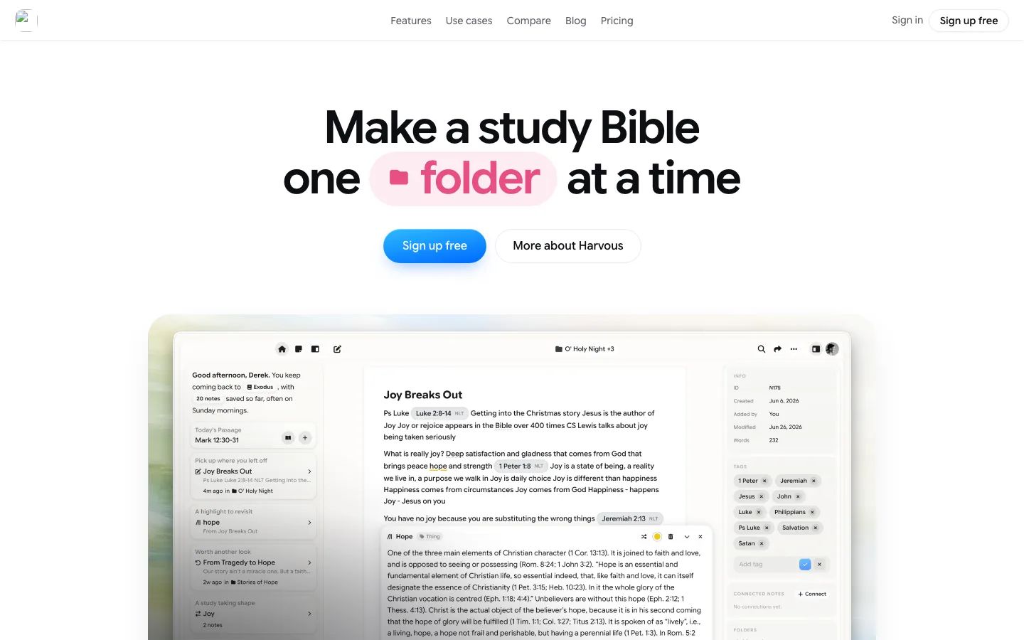
Aug, one note at a time The site rebuilt in Astro, with a pill that cycled through what you could save.
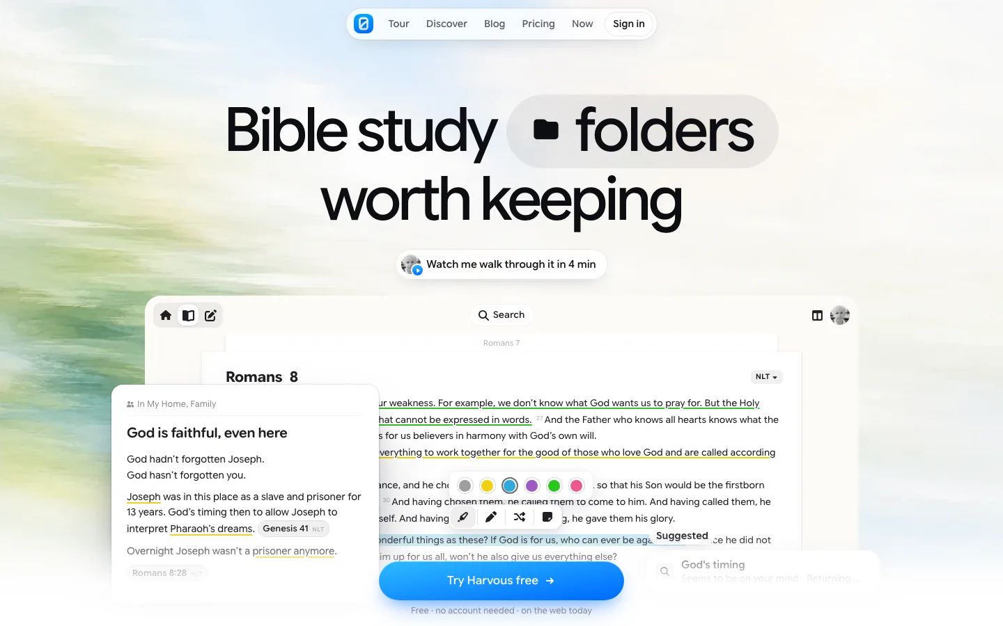
Sep 26, worth keeping A new design on a painted sky, with the app rebuilt from its real parts.
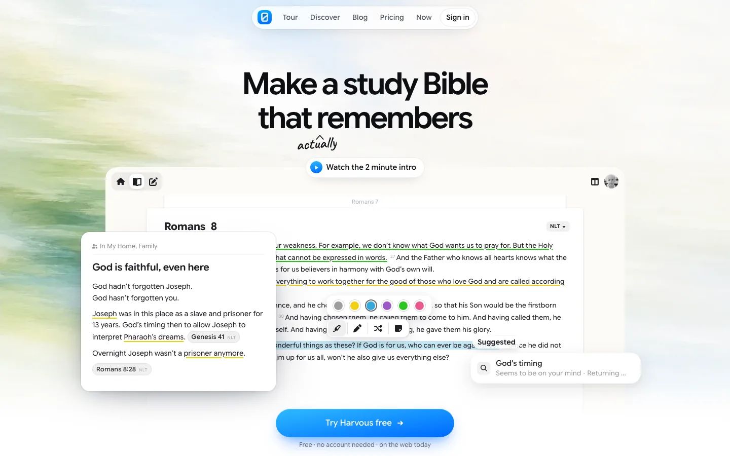
Now, actually remembers Live now, with the one word that mattered most written in by hand.