What they needed
Koati is my own app, an inbox for the requests a team gets. Its site had to say what that means in one line and show the app doing it.
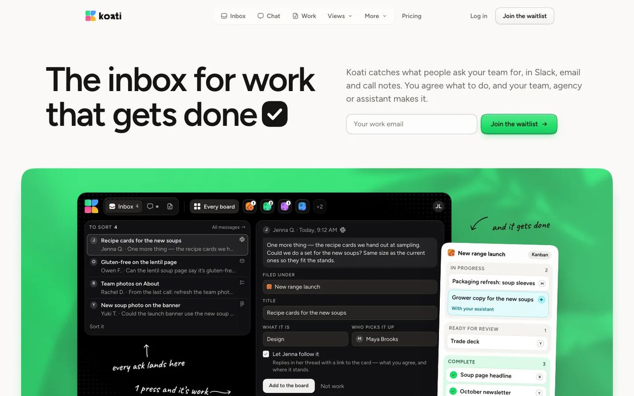
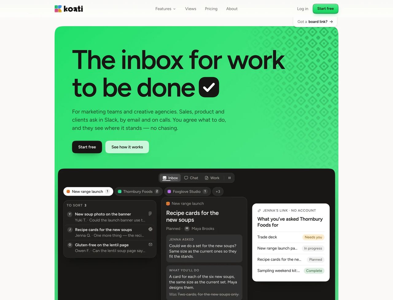
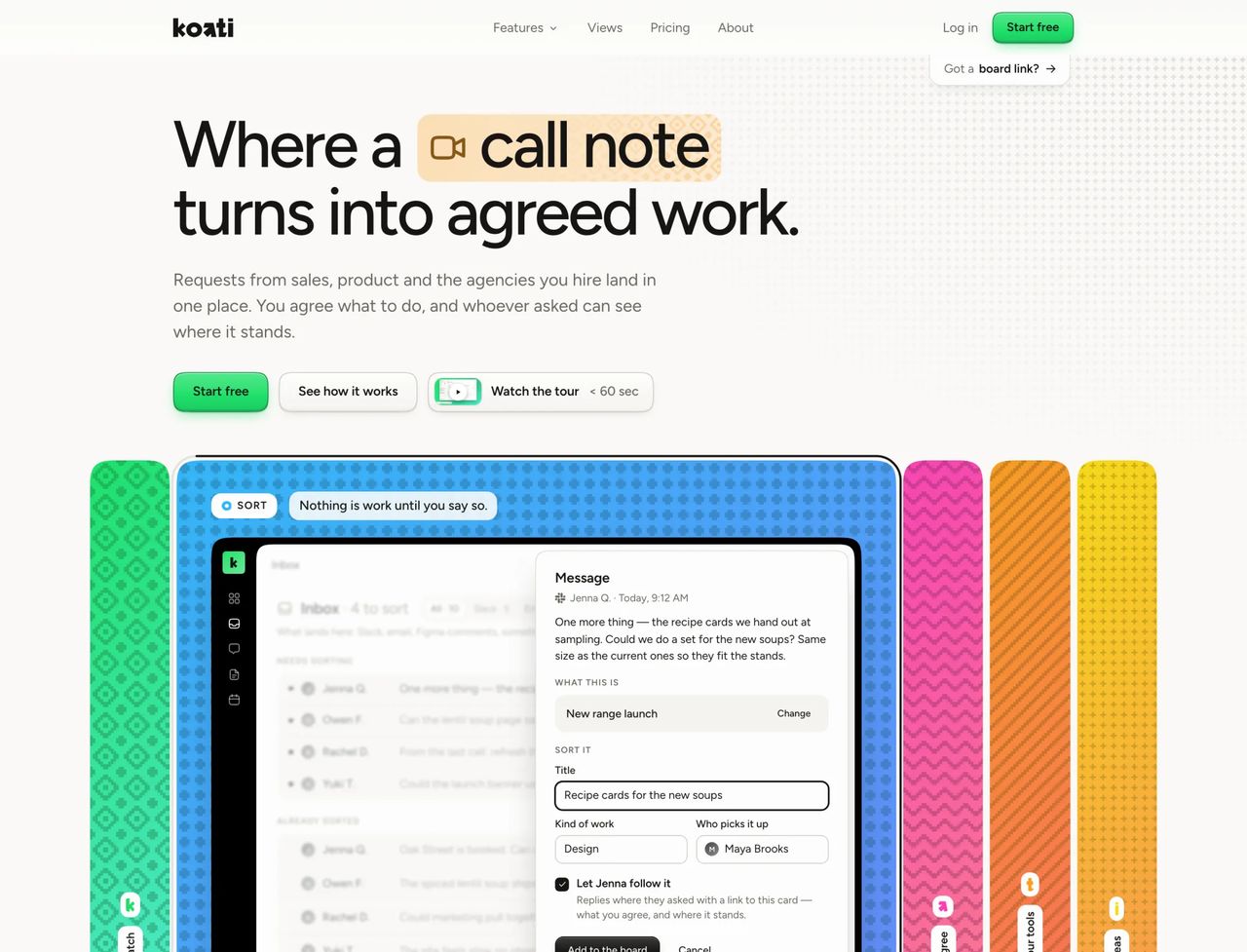
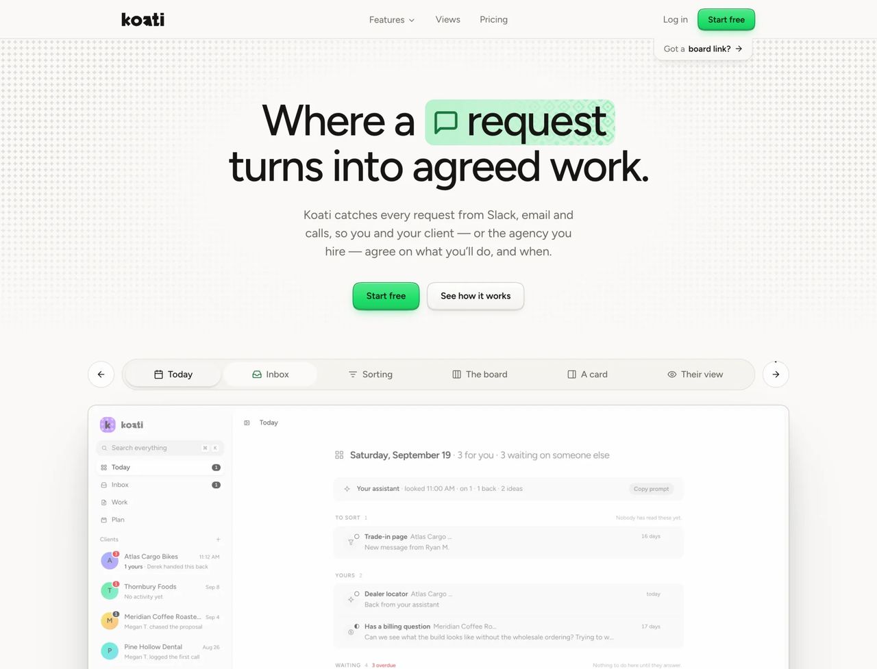
It went through four versions in six weeks as the app and its brand settled: a wordmark and a green button, then woven tiles for each step, then the K on a green canopy, and the one live now.
What I built
The live site leads with one line, the app itself on a green woven band, and a waitlist. Every picture of the app on the site is drawn from the app's own parts, so the two never drift.