Site tour — use cases, features, the founder letter, blog, and release notes.
What they needed
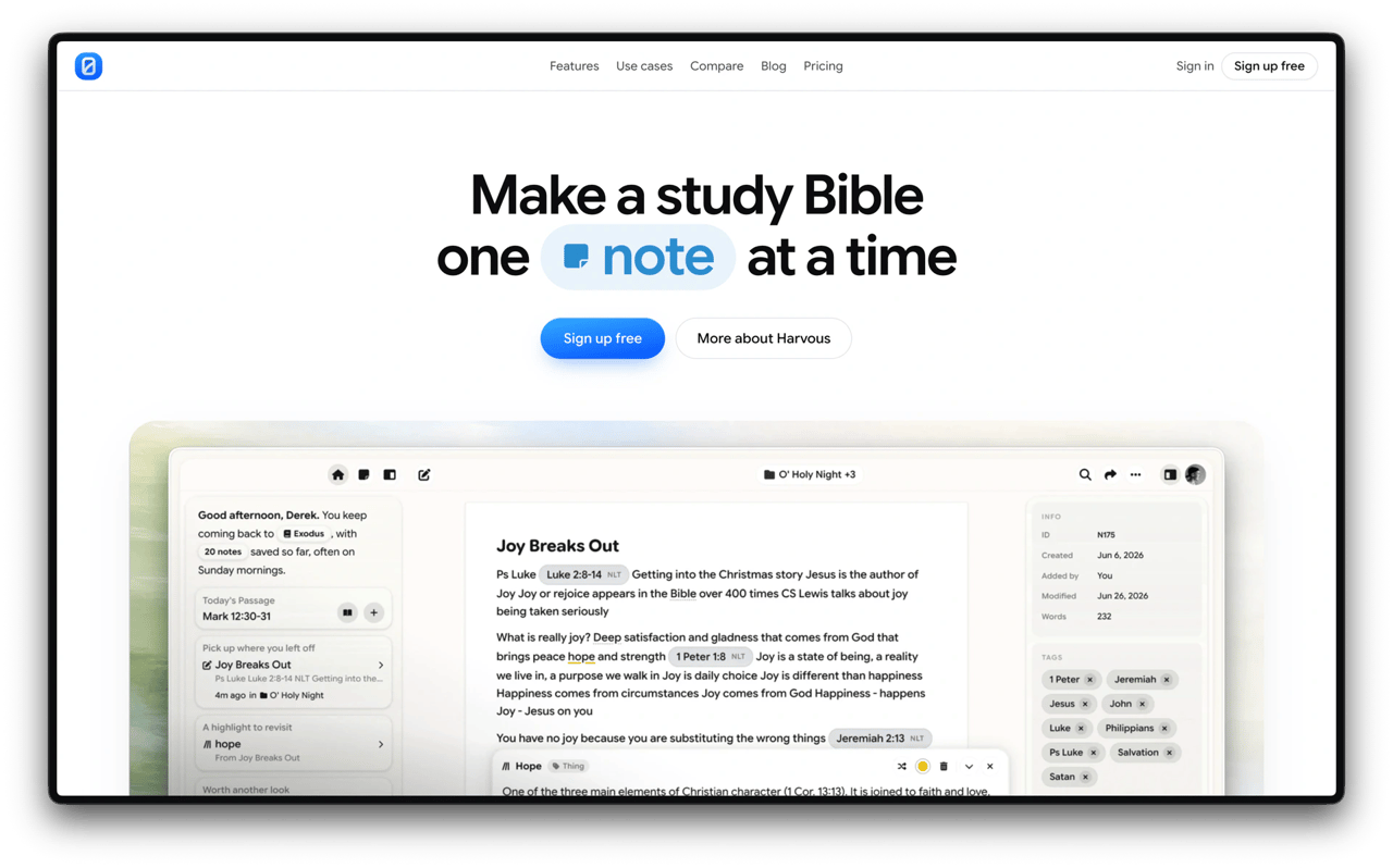
Harvous is a notes app for Bible study. The marketing site has to explain a product people often confuse with a Bible reader or a daily devotion—without sounding like either—and get the right people into a free signup.
I designed and built the current harvous.com end to end: positioning, page system, and the live site that carries use cases, features, a founder letter, blog, pricing, and release notes.
The problem
The first Harvous.com was a founder letter with device mockups. It was honest, but thin for visitors who needed to understand who it’s for, what ships in the product, and why it isn’t “another Bible app.”
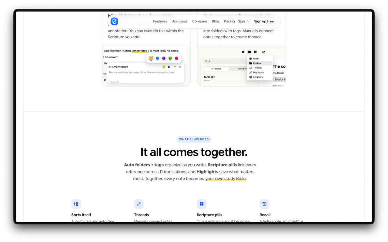
As the product matured—threads, scripture pills, highlights, recall—the site needed room for proof, pathways by use case, and a publishing surface (blog + release notes) that matches how the product actually ships.
What I built
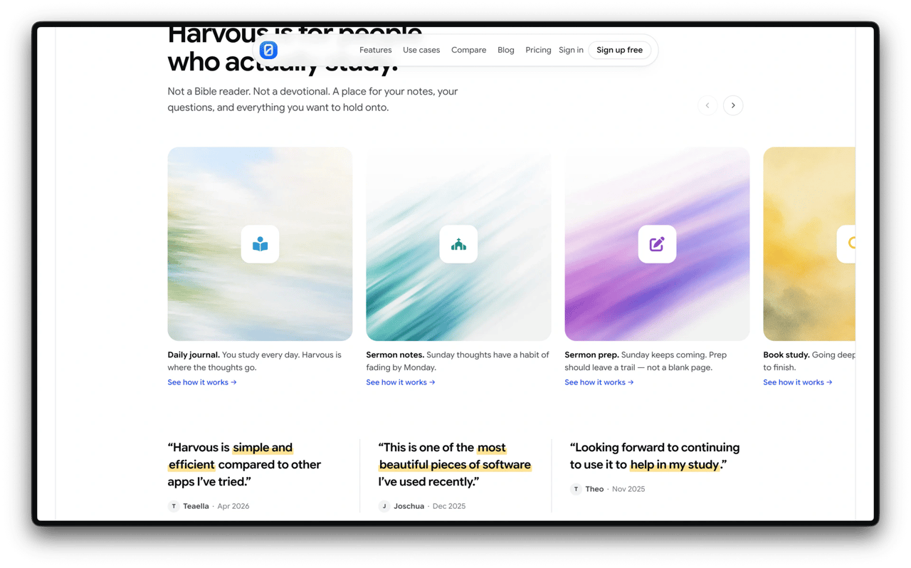
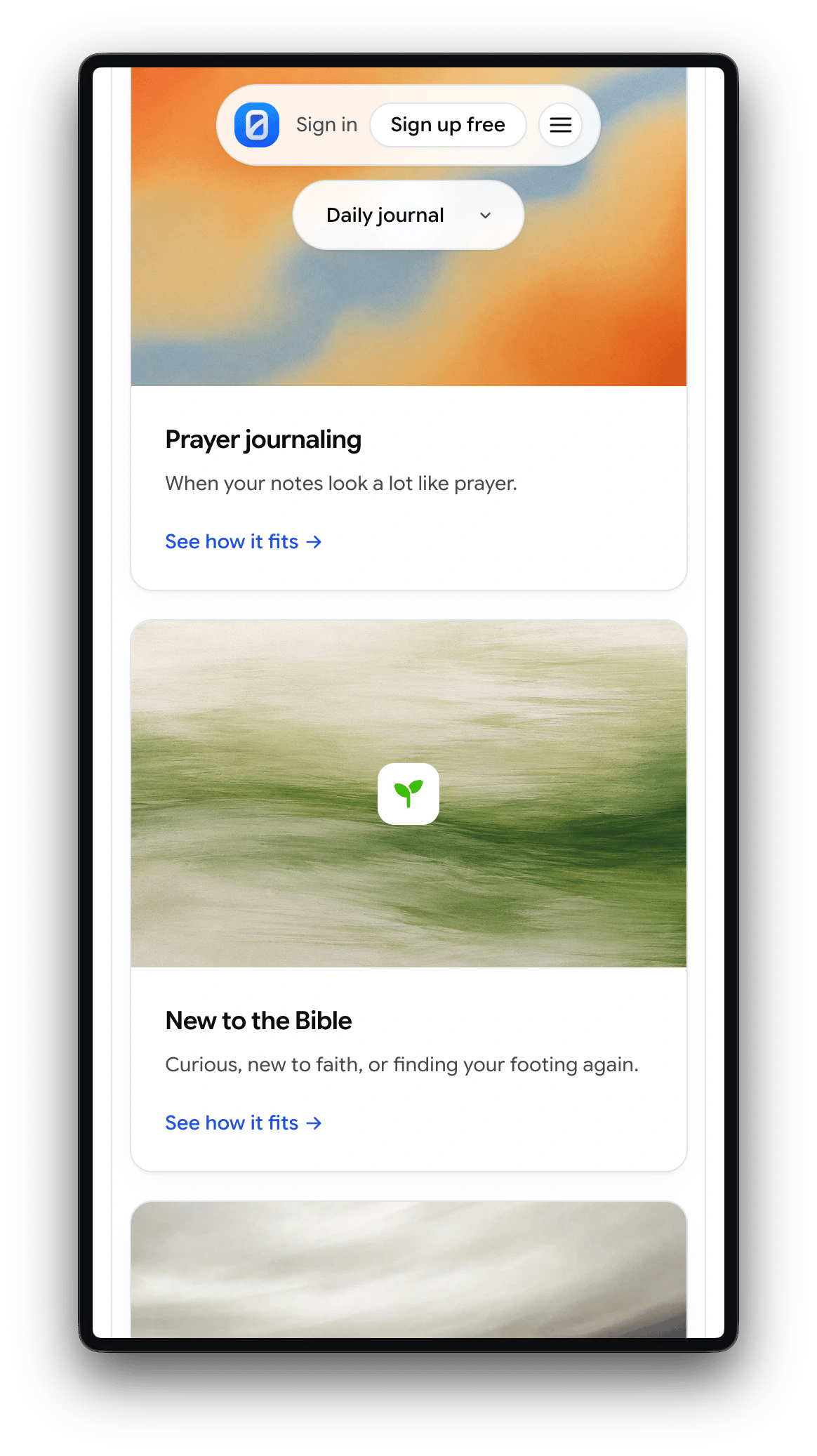
The redesign leads with a sharp line—“Harvous is for people who actually study”—then opens into use-case cards (daily journal, sermon notes, prep, book study) and social proof before the deeper product story.
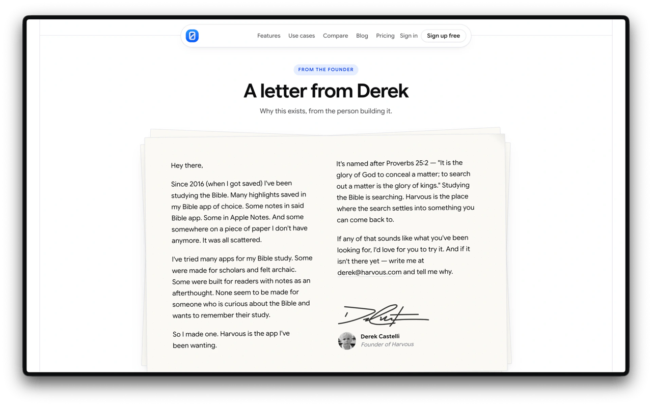
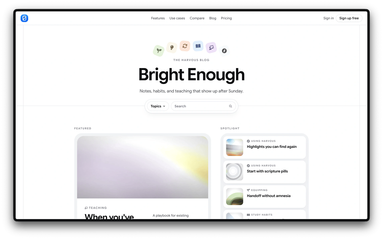
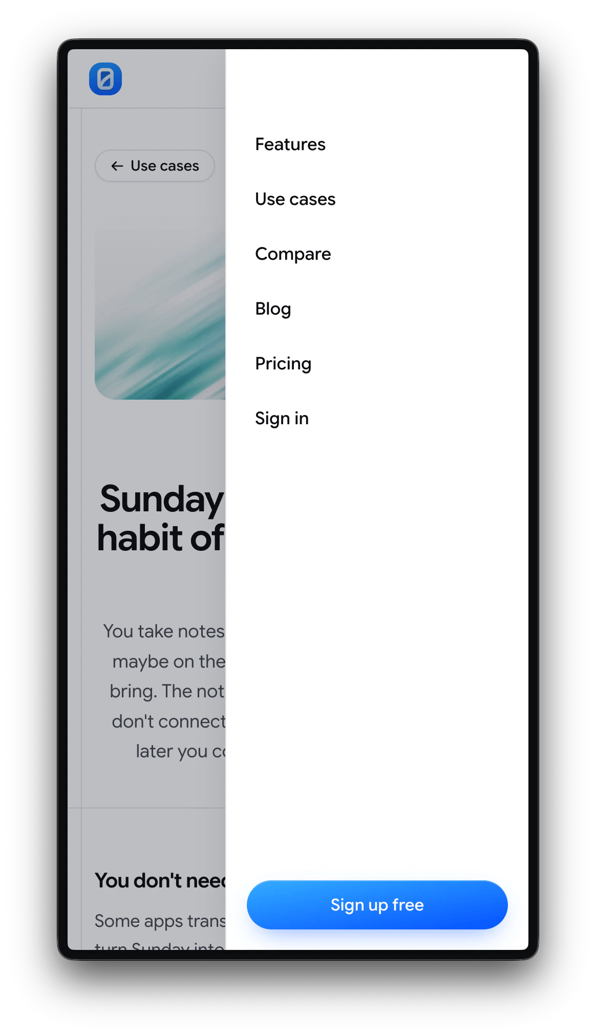
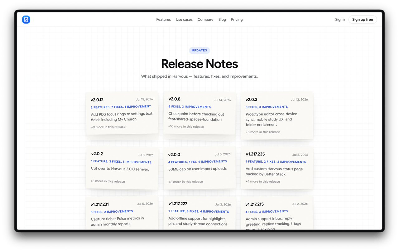
Features, compare, pricing, and a personal letter from the founder sit in a shared nav system. Bright Enough (the blog) and Release Notes keep the marketing surface in sync with what ships. Mobile gets the same hierarchy with a compact menu and card stack.
The work
- Full redesign of harvous.com: information architecture, visual system, and responsive build
- Use-case pathways with illustrated cards and testimonial highlights
- Features narrative (“It all comes together”) with product UI callouts
- Founder letter page, Bright Enough blog index, and Release Notes grid
- Mobile nav and use-case browsing patterns
The version before
Jan 2026
Visit harvous.com On the Wayback Machine
The live site is the current redesign. Wayback Machine shows the prior Jan 2026 version.